

Armor Boxing
Creating Support and Resources to Strengthen the Community.
Team: Israel Casas & Eun-Hye Rho
Because our Team dynamics worked so well during our Bengie’s Drive-Thru Theatre project, we decide to partner up again for Armor Boxing’s UX Design project.
My role mostly consisted of working together with Israel on Synthesizing our User Research, Brainstorming, and Designing the UI prototype in Figma. Someone the main roles I took on were Content strategy and UX writing.
Duration: a 4-week design sprint
Tools:
User Interviews
Affinity Mapping
User Personas
Competitive Analysis
Content Strategy
User Flow
Creating Design Systems
Wireframing
Prototyping
Usability Testing
Overview:
Armor Boxing is a non-profit located in Atlanta, GA. They want to fight the world’s mental Health Crisis by establishing a supportive community for those struggling with mental health. They want to bring awareness to negative mindsets and replace them with positive empowerment through boxing, motivational speakers, social support groups, and vulnerability. My UX partner and I re-designed Armor Boxing’s website based on users’ motivational factors of seeking out helpful resources. Understanding that mental health struggles are a tough battle to fight, we wanted to re-create Armor Night’s web presence to be place of support and motivation for users. The goal was to encourage users to register for Armor Night’s events. By conducting user Interviews with those going through Mental Health, we were able to create a webspace that bring users motivation, and resources based on users’ needs, wants, and understanding their pain points.
“How is this going to help me? And Why Should I get help? ”
Our First Assessment:
Because this was a project proposal coming from us to the client, Israel and I decided to do a quick website assessment to offer some initial feedback of Armor Boxing’s website. There is Boxing and there was Mental Health. But how these two connected was a question that was not answered when we took a look at the website. Our Client, Owen Meadows’s, requested deliverables were to create a better user flow for the website and his goal was to get people to register for the Armor Nights. Our first thought was to figure out how to make the website more user-friendly and address the “How does armor nights support mental health?” Because people tend to jump to solutions that was our first instinct on how to solve the problem of the website.
Designing solution-based designs are always going to be tempting. However, when we presented our passion project to our wonderful General Assembly Instructor, Stephanie Gausby, she encouraged us to dig deeper into WHY people who struggle with mental health don’t seek out resources available to them. She suggested we to look into what motivates and un-motivates people to seek community support. Because understanding the WHYs would help us understand our users on a deeper level, and design Armor nights to become a motivating factor & a resource for community support.
OUR USER RESEARCH
Competitive Analysis:
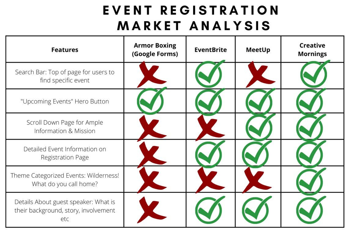
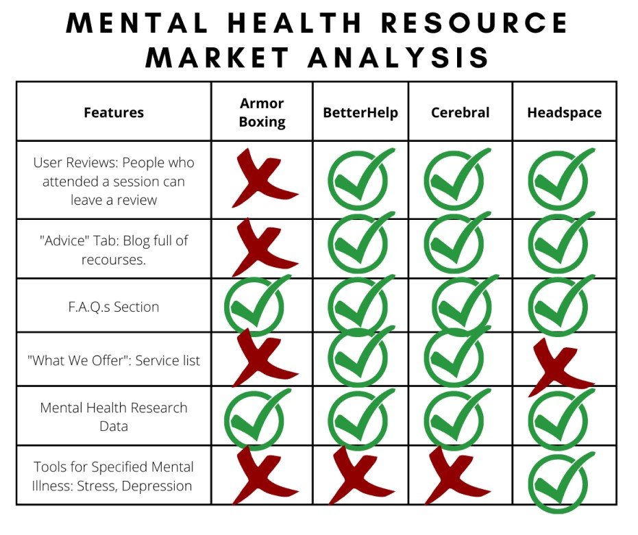
As Israel and I were scheduling our users for interviews we decided to efficiently make use of our time and do some comparative analysis. From the Competitive Analysis, Israel analyzed two sets of data features. Mental Health Resource Market Analysis and an Event Registration Market Analysis. Because Armor Boxing was like a mental health resource community, Israel analyzed other competitive or mental health resource webspace to better understand their design features and tools. Similarly, because Owen’s goal was to get users to register for the Armor Night events, Israel also looked into various Event registration websites as well.
We realized that Armor Nights needed:
Reviews are necessary to see what the community is saying.
MORE mental health resources are other than event info and data.
Needs ample information to understand what this nonprofit is about.
Detailed event information registration page.
Need to know more about the speaker at these events.
My Heuristic Analysis:
I did a Heuristic Analysis of the website to see if there were any design principles that needed to be improved. For the most part the website had a good UI presence. A user even stated that it didn’t scream “Non-Profit” because the design was modern and simple. But there were some slight issues that I found.
Needed to tighten up on the Consistency and Standards
Had different fonts throughout the website. Need to stick with one or two Font style
But the color usage was consistent

Help and Documentation
Need a Resource section for users to have more information about Mental Health and Boxing.
Because Armor Boxing is at its beginning stages, setting up information for the events can become last-minute adjustments. As of right now the event dates and the speaker information is something that is not scheduled out in advance. Once they get the non-profit up and running at a good pace, it would be nice to have the information ready in advance.
User Interviews
Once we schedule our Users for interviews we were set to find out the Motivating and Non-Motivating factors of people who had or is struggling with Mental Health and how they sought or didn’t seek out resources.
Our Interviews Questions delved into these Topics:
User Testing of the current Website.
Mental health History
Mental health and seeking out Solutions/ Resources
Mental health and seeking out Community
Exercise/ physical activity while going through the Mental Health Journey
Religious or Spiritual connection during the Mental Health Journey

SYNTHESIS
Key Takeaways:
Community is a biggest Motivator and Non-motivator
People want to feel safe when entering a social circle, especially in a community that talks about mental health topics. Being open to Mental Health struggles puts a person in a vulnerable state.
They don’t want to feel judged or feel pressured to think a certain way. Users want to feel free to be themselves no matter where they are at in their own story.
People want to be able to relate to the community, and the speakers, making them realize they are 1) Not alone in their own journey and 2) They want to get motivated to move forward.
[This portion of the research is what helped us design our content strategy for the web page]

Readily available and easy to access resources:
It is already a challenge to function throughout the day when people struggle with the heavy weight of Mental Health. Most of our users were able to gain access to resources because it was readily available to them. One of the users we interviewed was in the military and found mental health information constantly advertised. The constant reminder of the resource helped him seek help easily. Similarly one of our users that was a student said that resources were readily available on campus. However, one of the users said she had google for mental health help and couldn’t find good community support groups.
How people improve their mental health journey:
All of our users have stated that one of the best coping techniques they’ve used was mental mindfulness and changing the way they think.
Seeking out professional help like counseling and psychiatrist
There was a strong reaction to the Idea of Armor Boxing being a Faith based Non-profit:
People are open to spirituality but some of them have a negative reaction to church because of their past religious traumas
The reason why People Exercise:
They wanted to look good and boost their confidence
And they knew that there were mental health benefits.

Based on the Synthesis, we started to think about How Might We solutions in order to start brainstorming design ideas.
1st User Testing Takeaways
During our user interviews, we also did user testing on the current website to see how users currently navigate through the website. What we learned from the user testing:
Users want information readily available upfront. There were some questions they had that they thought could be prioritized on the landing page so that they were less likely to hesitate to register for the events.
We also found out that in the Register forms, it would be better to explain why certain questions are asked.
Users’ Personas
After synthesizing the data, we created users’ personas that encapsulate the target users we were designing for. When presenting the User Personas to Owen, he actually said he knew who these personas were. And that he had actually met these people in Armor Nights. What we had researched aligned and encapsulated what he has been seeing and the direction that his team has also been planning to take the Non-profit.


IDEATING, DEFINING, & DESIGNING
Design Systems
Not wanting to deviate from what Armor Boxing already has Israel and I created a Design System so that we could use the same styles for buttons, colors, text, and fonts. This was necessary when Israel and I worked and divided up our work. A Design system helped us have consistent components to use.

Content Strategy and Writing
Understanding the necessity that the website needed to feel welcoming, we felt that it was important to establish the tone of the writing. The tones that we were going for were: Empowering, Welcoming, and Relatable.
Empowering - The goal of Armor Boxing is to encourage people, so showing using action and positive words throughout the website would help with the tone of Empowerment.
Welcome - Indicating to come as you are and that everyone is welcome helps users feel like it won’t have to take effort to feel accepted.
Relatable -. Having very human and down-to-earth conversations allows people to have their guard down and not come in a performance mindset. We didn’t want to go formal with Armor Boxing, because we wanted the users to feel like they can be themselves. Showing empathy and understanding that things are tough allows users to feel like they are accepted no matter what part of their journey they are on.
Sketching / Brainstorming
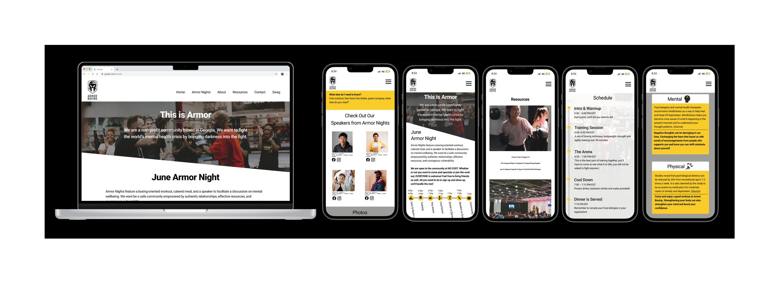
Our approach to Armor Boxing’s design was to concentrate on a Mobile Responsive design website. This was because Owen stated that most of their website visits come from Instagram. Since most people use Instagram on their phones, we decided to make the mobile response a priority. However, we still had time to create a desktop version of the website as well. Taking the key points from our research we brainstormed design solutions based on the Users’ wants.

Feeling like a supportive group
One of the biggest motivating factors of people seeking out social groups is feeling welcome. We designed a welcoming presence utilizing our content strategy and also designing a space for testimonials. We got this idea from the competitive analysis. Testimonials from real people saying that they felt community and welcomed would help lessen the ambiguity of how users might feel about the social space they will be registering for.
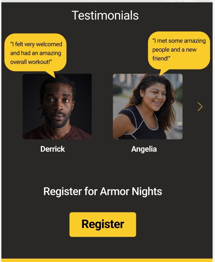
1st Testimony Idea. Having faces with the statements would be visually helpful.
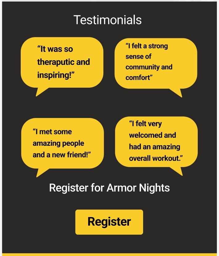
2nd Testimony Design Idea. This one is without pictures. We were trying to be considerate to those who didn't want their image online.
Convenience
Adding A Resource Page: Understanding that Armor Boxing’s mission was to be a supportive resource for Mental Health, it made sense to add a Resource page for those seeking helpful links. We saw that other Competitive sites had resources. Moreover, Users that sought out resources said that they were able to because it was conveniently around them. Marking mental health resources convenient helps motivate people to find what they need. When we presented this Idea to Owen, we told him resources could look like a variety of things. It could be links to articles, blogs about certain topics, or links to help users get connected to other resources. Owen said he is more comfortable writing blogs and so we designed a resource page for blogging.
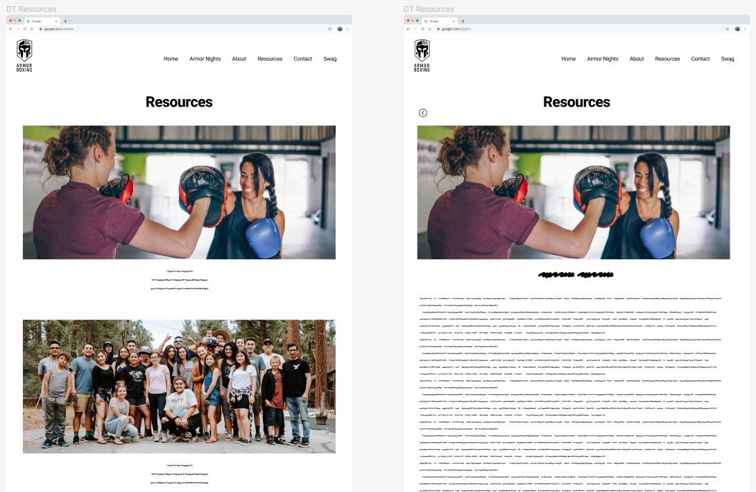
Desktop Version of the Resource Page
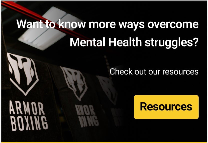
The landing page has a section to direct the users to our Resource page.
Motivational Speakers
Some of our users have stated that listening to Motivational speakers was one of the ways they coped. Listening to speakers that were empowering helped motivate their lives. Understanding this, we thought that including social media links from the Speakers at Armor Nights would help users tap into positive content. If Armor Boxing’s goal was to be a helpful resource, this would be another helpful step for those needing positive words. Not only that, but users who are debating whether or not to register can also see what type of speakers are coming to these events. The more they know and understand what they are registering for, the more they feel assured about the event. Ambiguity never helps.

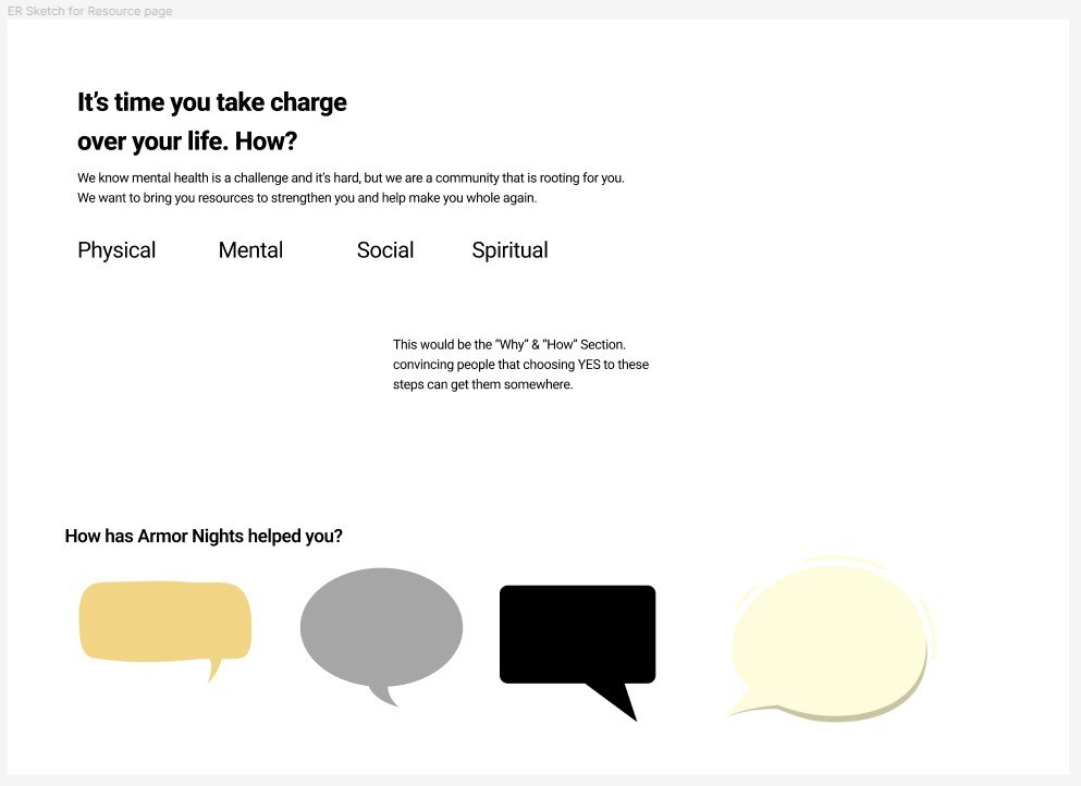
WHYS
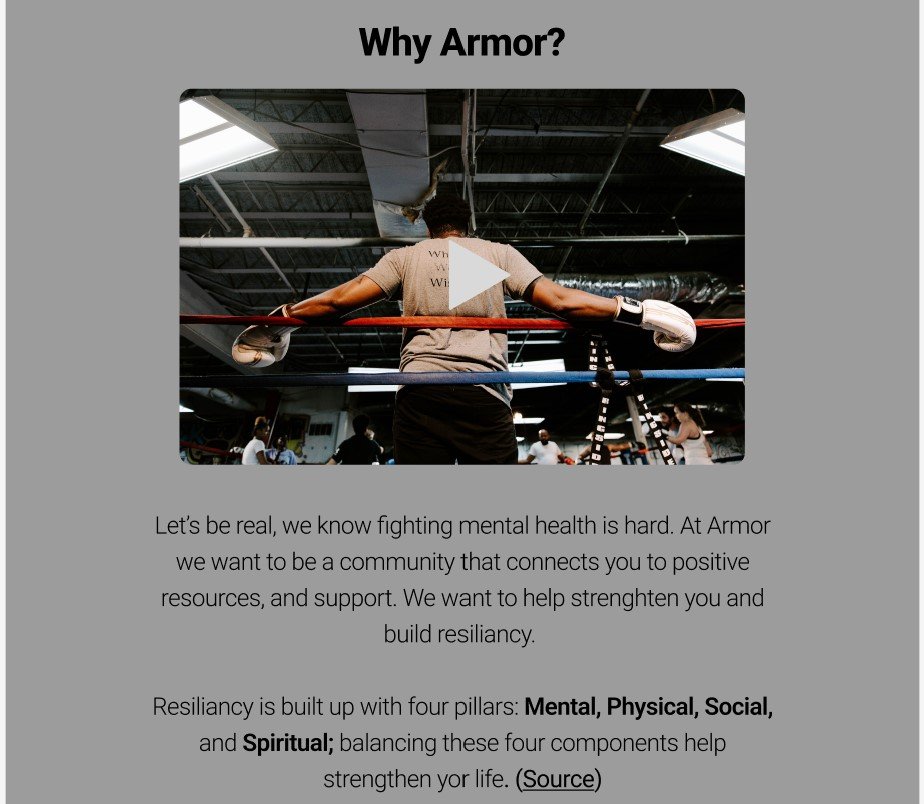
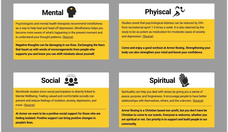
Armor had statistics at the bottom of their landing page, but they were all statistics about how many people struggle with Mental Health. Although this might bring awareness, this doesn’t seem like a powerful motivator to convince users to participate in Armor Nights or have them seek out help.
Everything that Armor Boxing brought to the table reminded me of what I learned in Air Force Boot Camp. Resiliency is built on 4 pillars: Mental, Physical, Social & Spiritual health. If those pillars are in good standing, people have better resiliency to life’s setbacks and hardships. So I researched for Mental Health resources that were tailored around those 4 topics. Using those sources I changed the statistics card into cards that show the reasons why people should look into registering for Armor Nights.
Our Responses to the 1st User Testing
From our 1st user testing, one of the biggest points that stood out was the fact that people had questions and assumptions in their minds when navigating the website. We understood that if these questions and ambiguity were answered, the users would feel a little bit more decisive and secure with their decision when it came to registering for the event. So we answered some of the questions that were brought up throughout the website mostly through UX Writing. And that some of the first feelings or questions were answered up front instead of the answers being tucked away.
Information about bringing a friend or the fact that you can just be a spectator were all in the registration form instead. Our users mentioned that it made more sense for information like that to be more at the forefront so that things are clearer
Most of our Users also mentioned that they like the timeline information of the Armor Nights. However, that was on the Armor Nights page and not upfront. So we decided to create a condensed version of the timeline and put it on the landing page.

USER TESTING
2nd User Testing
After creating our website re-design prototype we conducted our 2nd user testing.
Users said that they liked the explanation of the Mental, Physical, Social, and Spiritual pillars.
What could be improved upon was the wordiness of the landing page. Because we tried to accommodate for information being upfront the design became a bit wordy. A lot of our Users on the 2nd test skimmed the website and because there were a lot of words on the page the important information did not stand out. We went ahead and condensed some information and added more visuals to give the eye a mental break.
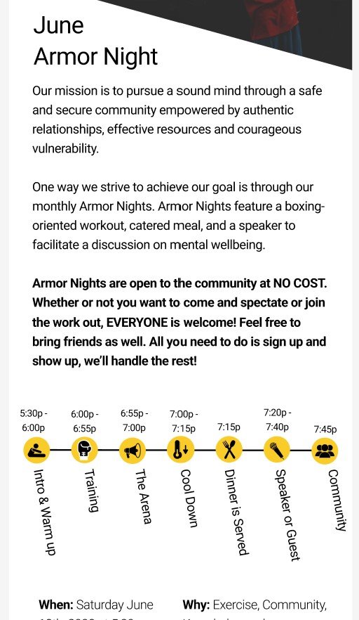
1st version of the Mobile Response Landing Page. This version is wordy.
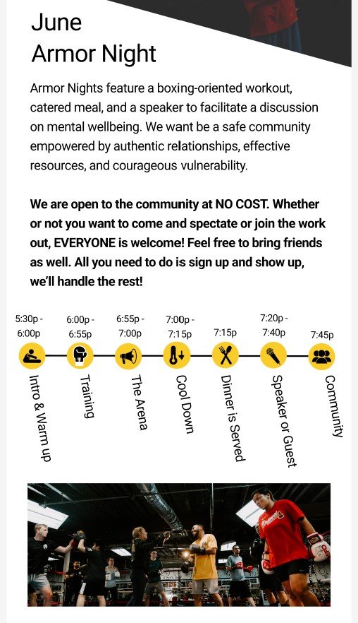
Our response to the 2nd User testing. We condensed the writing and added an image for a visual break.
PROTOTYPE
Next Steps
Because our client used Blue host and Word Press the next steps would be to compare actual KPI data from before the design changes and after the design changes. It would be good to see how many users take time on each page. Seeing the metrics on the new resource page that is created and how long users stay there would tell us whether or not the material is engaging or helpful. Last but not least, seeing whether or not there was an increased ratio of visits to registration would help us determine whether or not our designs were successful in motivating people to join Armor Nights.

My Takeaways
Challenges
One of the challenging pieces that we had to do when thinking of content strategy was how to navigate the spiritual/ faith-based portion of the website. Different users from the first user testing had different reactions to the religious context of the website, but all of them had a similar question. How much of this event will be centered around Christianity?
Our suggestion to Owen was to be upfront about what this event was centered around and how much spiritual aspect was going to be present during the event.
What Worked
Understanding the WHYs instead of our going with our initial assessment. Going deeper into that level.
I’m glad that we had Stephanie to help direct us to dig deeper into the WHYs of our users. We could’ve easily designed with the mindset of ““How do we tell a better story of how Armor Boxing helps those struggling with Mental Health?” But If we were to have designed on that surface level we would’ve just been slapping a design band-aid to a deeper human issue when it comes to people seeking out resources. Understanding why someone struggling with mental health would come or not come to an event and designing based on those WHYs is what created the backbone of our designs and direction for this project. This was a very good learning experience for me to take away from. I now know for other projects moving on, I’ll have to be slower to look for a band-aid design solution and make sure I am asking the right questions in order to understand our users better.